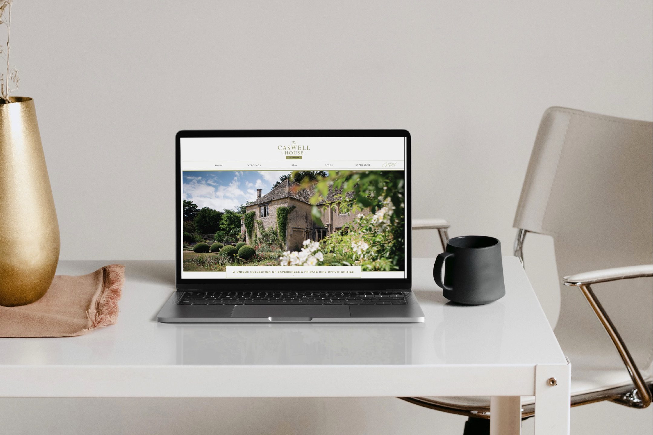
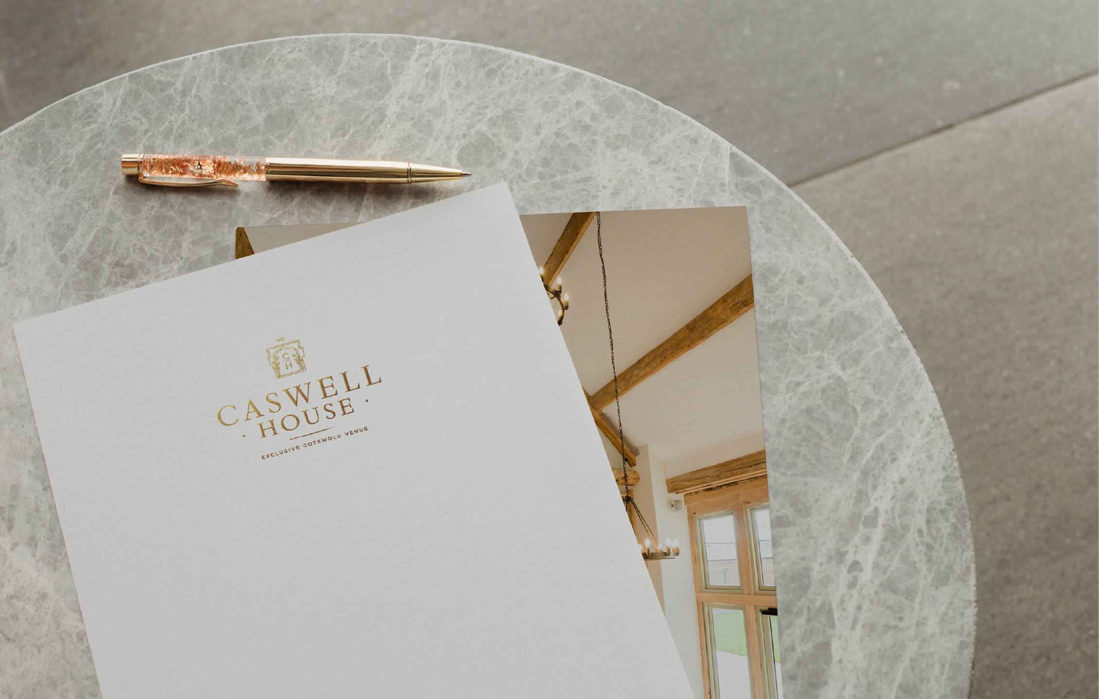
BRAND IDENTITY for the Wedding & Hospitality industry | WEBSITE DESIGN | STATIONERY | SIGNAGE |
THE BRIEF: To create a brand that fits beautifully with the values of the business, be luxurious and styled impecably to reflect the wonderful historical attributes of the estate and its wild holistic countryside surroundings.
THE LOOK: High end, professional, elegant, impactful
THE FEEL: Timeless, classy, sophisticated, close ties with nature and heritage
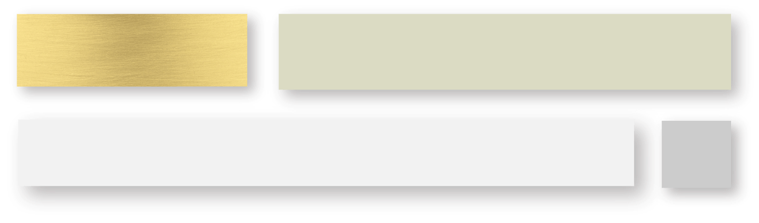
THE COLOURS: Soft luxe gold, muted sage greens, heritage grey
colour palette:
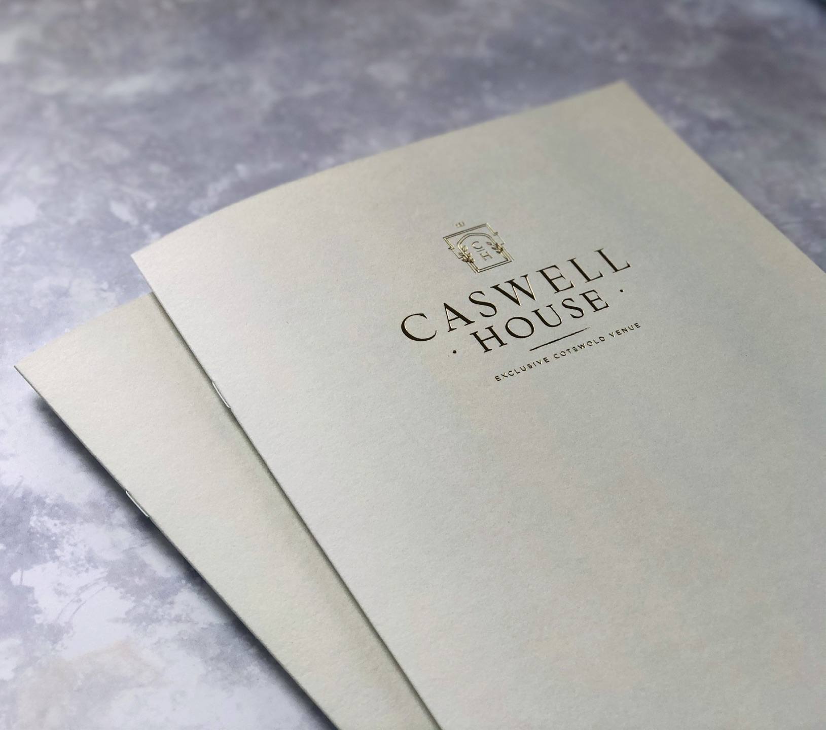
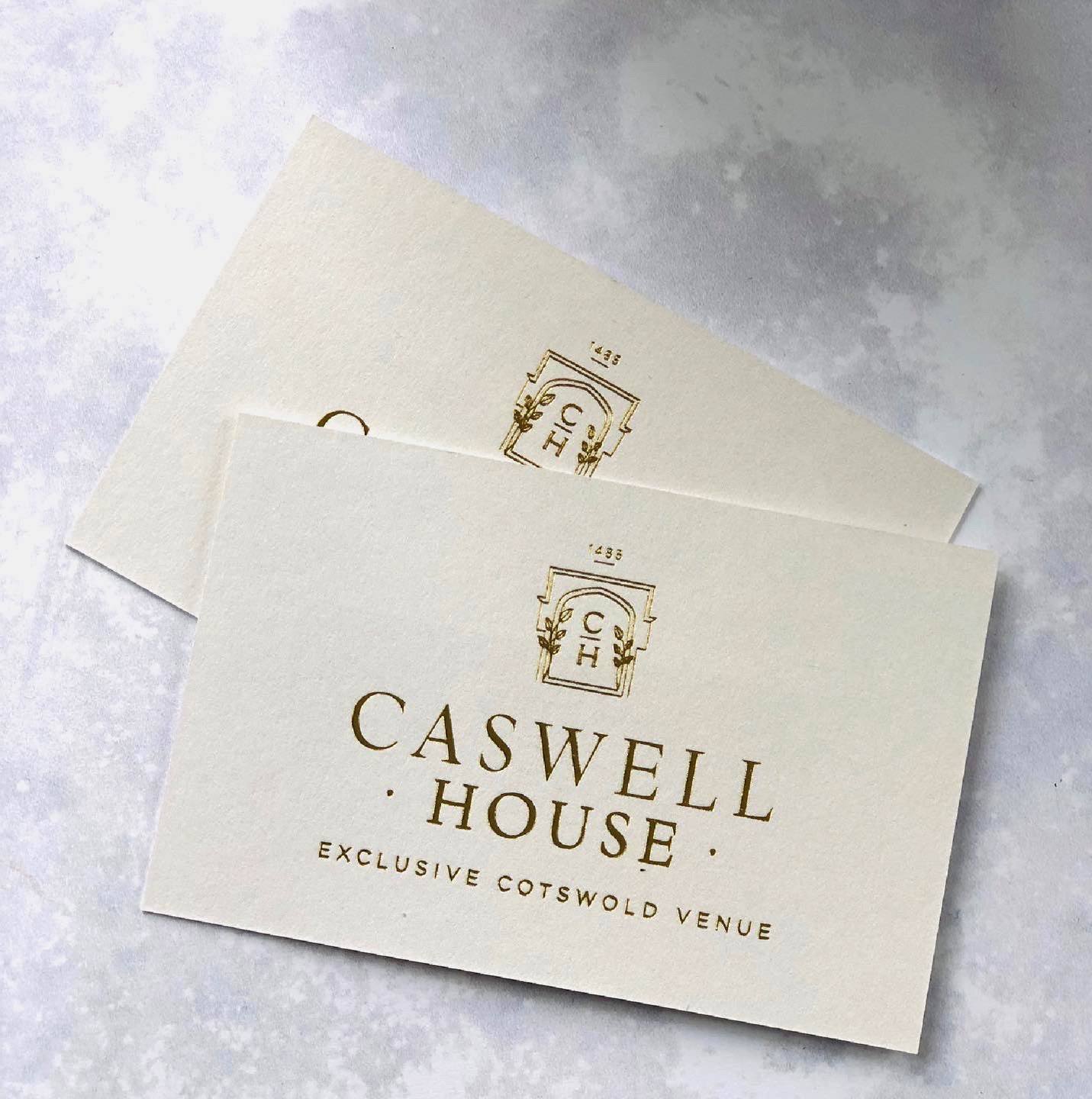
icon:
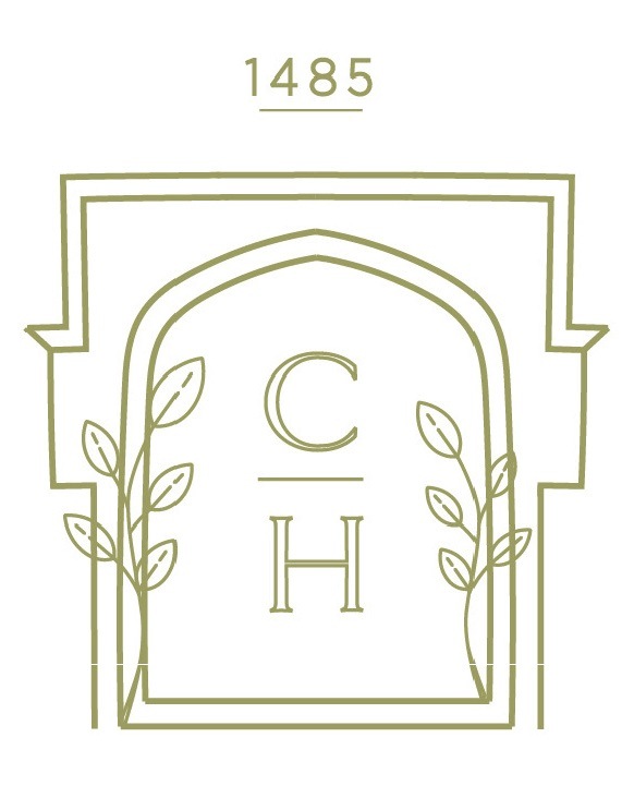
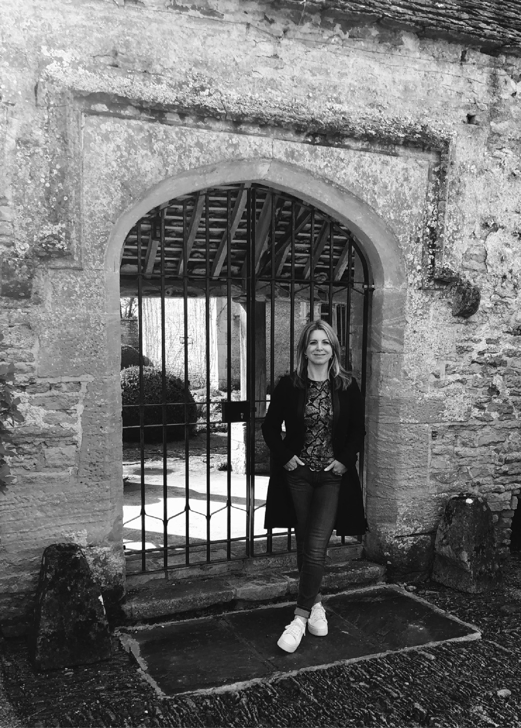
I took insiration for the icon from the oldest part of the estate…. a sixteenth century loggia in the heart of the main garden where (weather permitting) you can have your ceremony.
I hand drew the design keeping it as simple yet as close to the original shape as i could. I love that this is now the centrepoint of the brand.